Otis Frampton comes to Beacon City! METAs Cover Illustration, step by step!
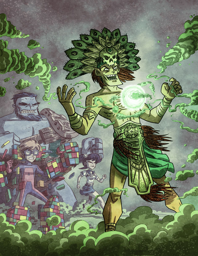
I’m very excited to welcome yet another new artist to the list of incredible talents I’ve had a chance to work with this year!
Otis Frampton, whose artwork has been seen in the satirical animated series “How it Should Have Ended,” has finished the cover illustration for our upcoming Beacon City METAs (Issue 1). Otis has shared the final artwork, but he’s also given me permission to share with you how he tackled each step of the production in picture form! To see all the steps of the project, click the “More” link below and check out the full blog post!
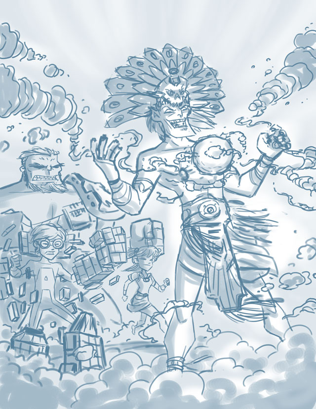
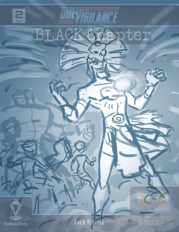
After I gave him the commission, the process began with me sharing some art resources with him (you can check out the characters from Beacon City METAs at our gallery page here), and suggesting the characters I would like to see. Otis liked my suggestions, and then produced this thumbnail illustration!
As you can see from the thumbnail, he used the cover to Due Vigilance: Black Chapter to get an idea of how our Masthead would look over the art, so he could frame an exciting shot. Pretty cool, huh?
After I (Gleefully) approved the concept sketch, he was off and running. I didn’t see any of the further steps until he was done, so you can imagine how delighted I was with the final product. He was kind enough to share with me the stages of production, however, and I’m now going to share those with you as well! In chronological order, here are the stages of the artwork. I can’t go into too much detail, as I didn’t do the artwork myself, but I think just by seeing the steps you can get a really good idea of how he works.
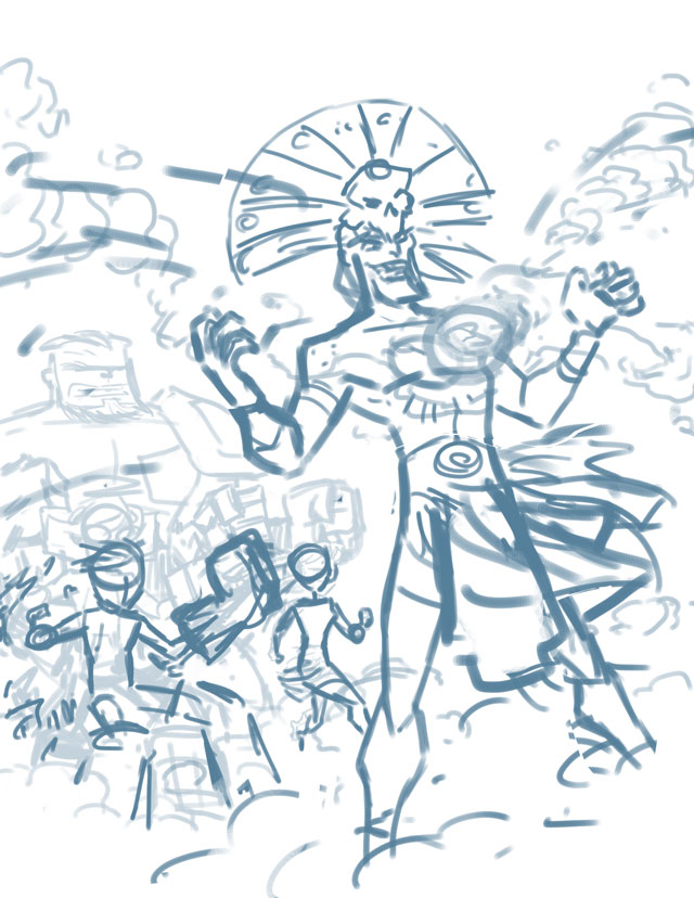
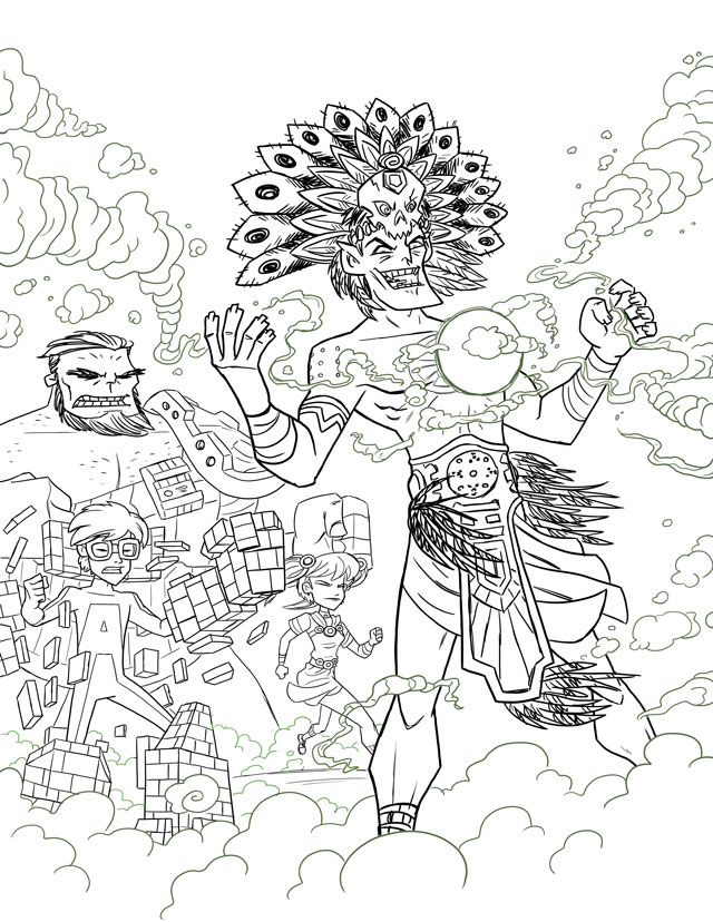


If you’re interested in seeing more of Otis Frampton’s art, check out his Deviant Art page here!


Leave a Reply