Tianxia Cover Art- From Concept to Cover
While we’re about ready to get Tianxia: Blood, Silk, and Jade ready to head to layout, I thought this would be a good time to share with you the cover art! But I can’t just show a single picture, we should really show you a little more about how we got from concept to the final illustration. This article will cover that process, and show off some never-before-seen concept sketches from myself and Denise Jones. I’ll let you decide which ones are better (hint: Denise’s). Click the “More” tag to head to the article!
We began with a phone call between myself and author Jack Norris. The two of us discussed what we wanted the cover to say about the book. We wanted to highlight the setting elements and the kung fu, and we decided we wanted the design to have a Yin-Yang balance without actually using the Yin-Yang symbol overtly. So we figured we’d use two fighters, one male and one female, fighting in the positions of the elements of the famous symbol. We picked out two of the characters who would represent the aspects of Yin and Yang and contrast each other, while both being from the “Sample Player Characters” roster. While we spoke, I sketched into photoshop to convey our idea to the artist. Here’s what I came up with:
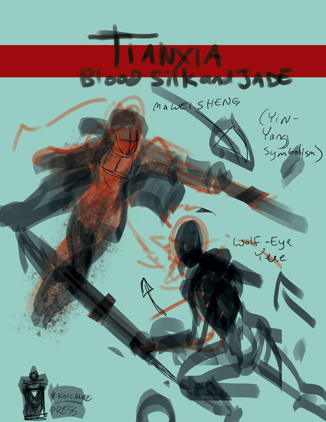 (Aren’t you glad I’m not the one doing the final art?)
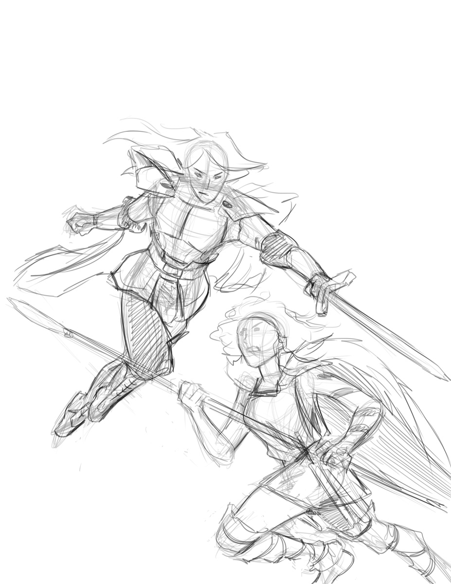
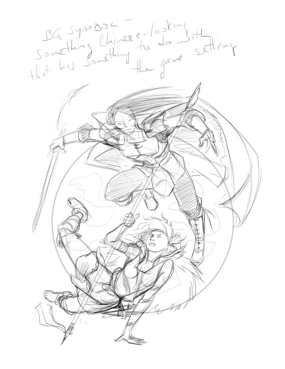
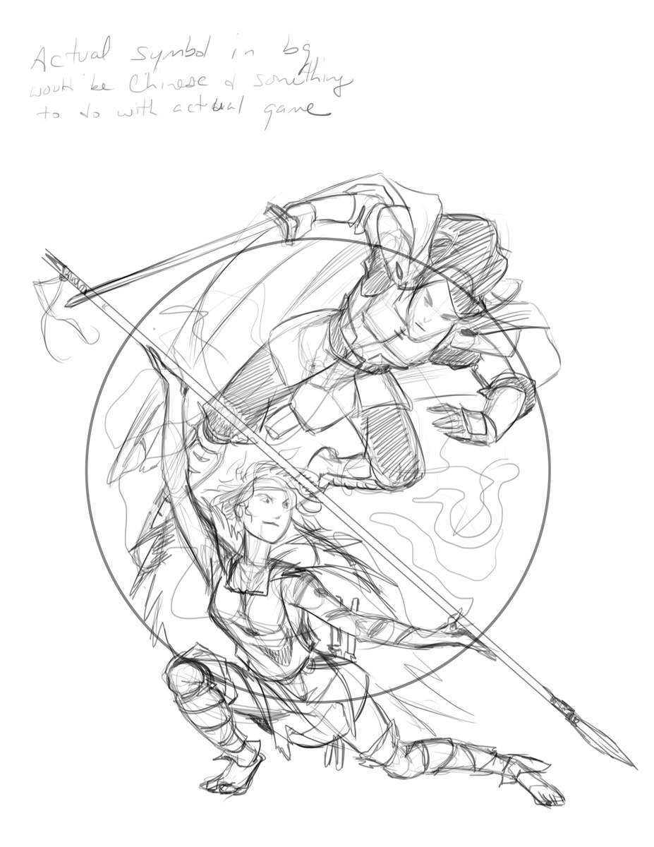
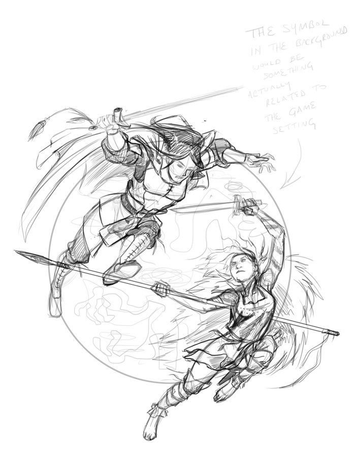
As you can see, this image leaves a lot to be desired, but it gives us a few guidelines: Color of the cover, the splash of red for the title, and the basic shapes and poses we wanted. I turned this over to Denise, and then she submitted a number of concept sketches where she added some elements to the image and refined it.
That last image is the one Jack and I agreed that we liked the most. It really captured the “Swoosh” feeling of a Yin-Yang symbol, showcased the characters and their personalities, and had the “Floating” sense of combat that we wanted for a Wuxia setting. Sold! Jack and Denise conversed a bit more about what the symbol behind the characters should be, and determined that it should be the Imperial dragon symbol, something to help represent the setting itself. With that, Denise worked her magic, and we have… (drum roll please…)
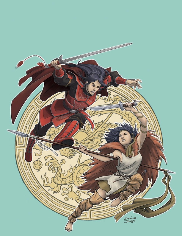
Ta-daah! The final cover image for Tianxia: Blood, Silk, and Jade! Thanks to Denise Jones for developing such a lovely image. I’m very happy to share it with you all. More Tianxia news in the near future!
-James


Pingback: Tianxia – Wuxia Hintergrundwelt für FateCore | FATE – Offizielle deutsche Seite für das Rollenspiel FATE
Pingback: Tianxia - Wuxia Hintergrundwelt für FateCore - FATE – Offizielle deutsche Seite